CASE STUDY
Kelly White Healing

ENGAGEMENT OVERVIEW
Our partnership with Kelly White marked a thoughtful evolution of her healing practice.
As she stepped into a new chapter, the objective was alignment. The brand needed to feel grounded, intentional, and reflective of the calm, client-centered experience she delivers in person. This was not a dramatic transformation, but a measured refinement.
We approached the engagement as a cohesive brand and digital alignment process, ensuring every touchpoint expressed clarity, softness, and quiet confidence.
The scope included a light brand refresh, a custom Squarespace website, and the development of a foundational brand system designed to support long-term consistency and growth.
-
Brand identity became the anchor, designed for longevity rather than trend.
We created a timeless, text-based logo supported by a serene, ocean-inspired colour palette and restrained typography. Generous spacing and minimal visual noise were intentional, reinforcing clarity, credibility, and ease.
A basic brand kit was developed to formalize the visual system. Logo variations, defined colour codes, typography standards, and usage guidelines ensured that the identity could scale with cohesion across digital and print applications.
The brand now carries a unified visual language that feels both grounded and elevated.
-
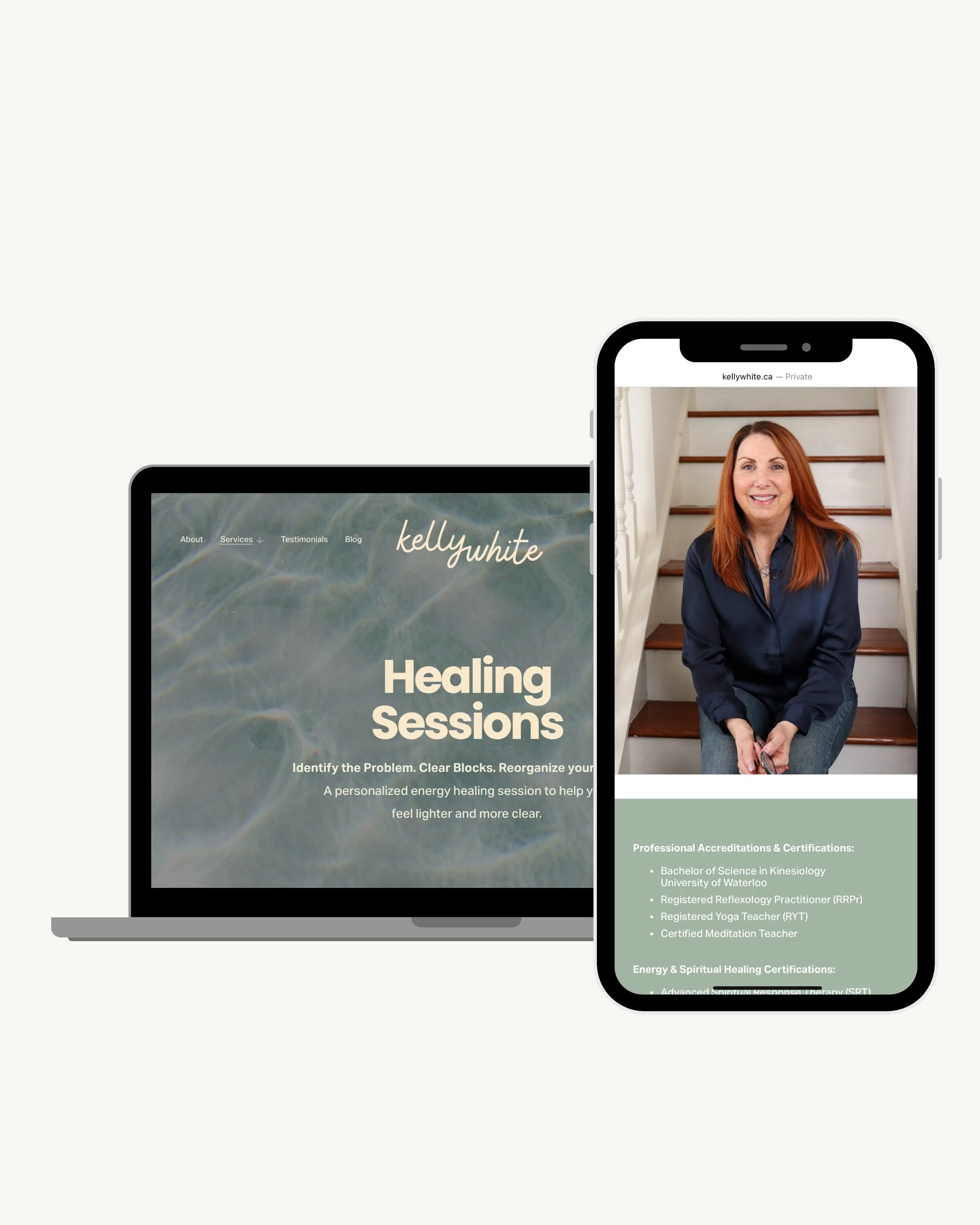
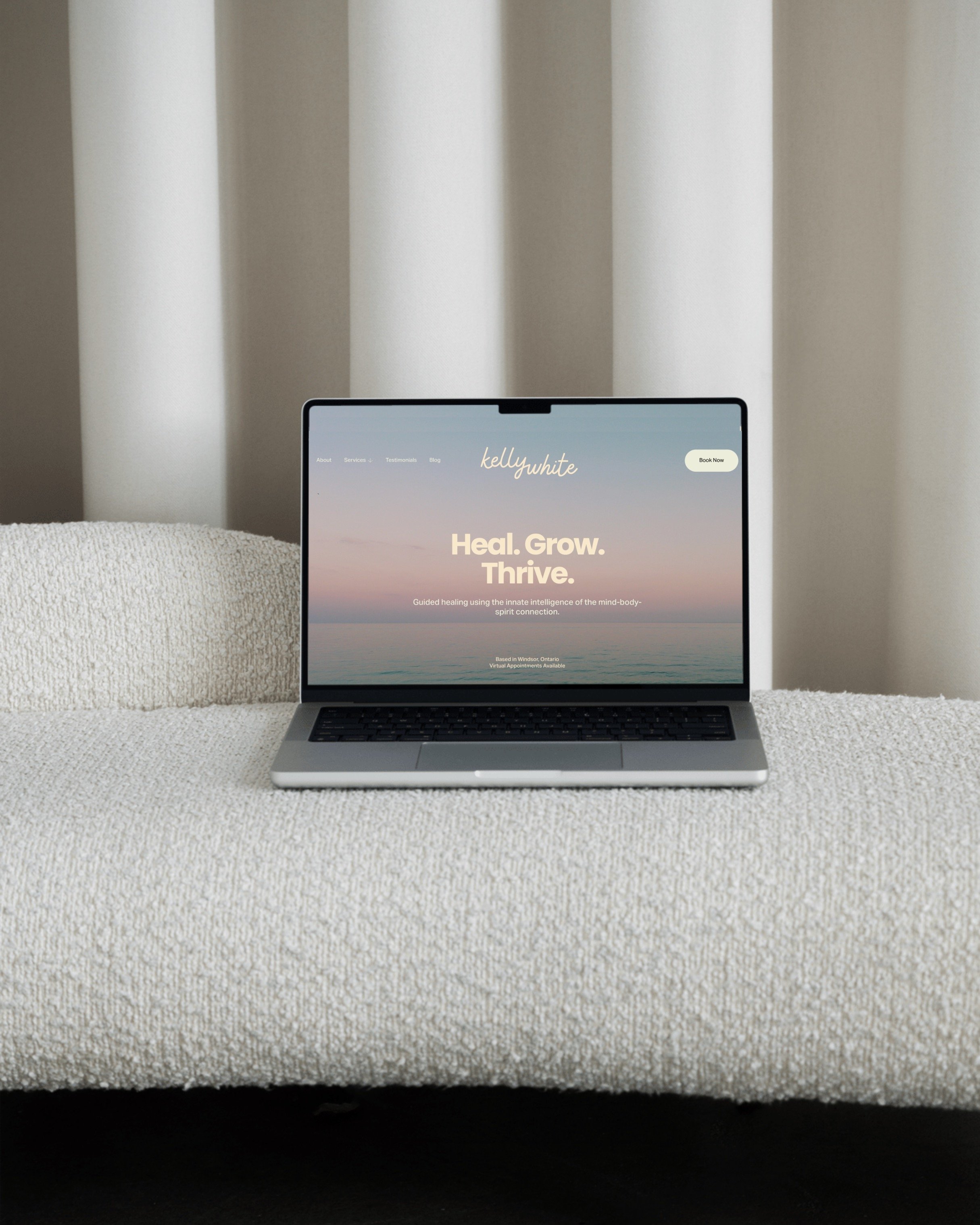
The website was built on Squarespace with refinement and usability as guiding principles.
Spacious layouts, soft transitions, and intuitive navigation create a digital environment that mirrors the tone of Kelly’s work. Each section serves a purpose — introducing her philosophy, outlining services, and guiding visitors toward booking without friction or overwhelm.
Service pages balance reassurance with clarity, while calls-to-action invite gently rather than press.
Mobile responsiveness was prioritized to preserve softness and balance across devices, ensuring that the experience remains seamless whether viewed on desktop or phone.
-
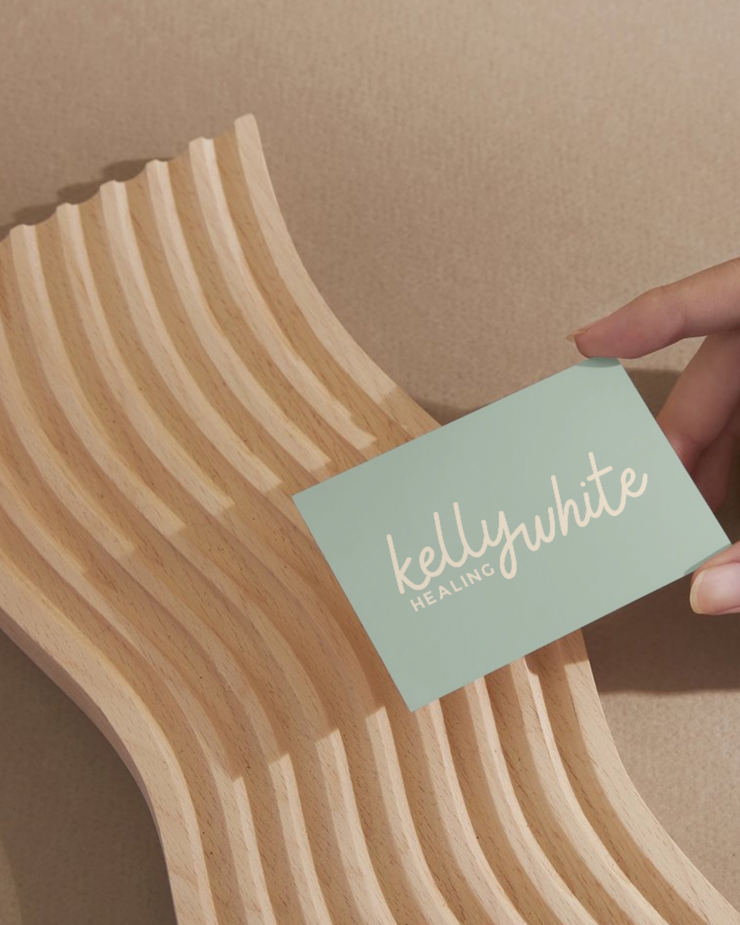
Physical materials were designed as an extension of the brand’s calm authority.
Custom business cards reflect the same minimal restraint found online, reinforcing professionalism and trust in face-to-face interactions. Every printed element was aligned with the broader visual system to ensure continuity across environments.
THE IMPACT
The refreshed identity aligns seamlessly with the energy of Kelly’s practice — composed, intentional, and clear.
The foundational brand kit provides structure behind the aesthetic, allowing future content and communications to remain consistent without dilution.
The new website offers both independence and scalability, giving Kelly the flexibility to evolve her offerings while maintaining visual cohesion.
The brand now communicates with quiet confidence, reflecting not only what she offers, but the experience she creates.